
7 Mistakes That Ruin Student PPTs (Before and After Slide Fixes)
Seven real student slides rebuilt from scratch: how to turn 120-word paragraphs, unreadable code screenshots and messy tables into clean visual slides in 15 minutes.
Your college presentation looks cluttered because you are using your slides as a teleprompter, pasting raw paragraphs from your project report or ChatGPT onto templates meant for printed handouts. To fix a messy deck before tomorrow's viva or placement presentation, cut every slide down to 15 words, push body font sizes to at least 28 pt, switch from dark mode to a high-contrast light background for low-lumen classroom projectors, and replace full-screen screenshots of code or Excel sheets with 5-line cropped snippets. According to Infinity College's 2026 Campus Placement Communication Framework, 60% of campus hiring decisions come down to communication, confidence, and attitude rather than technical skills and CGPA, and your slide deck is the first visual proof of how clearly you think.
In short
- Cut 100-word report paragraphs into a single 5-to-7-word takeaway headline and 3 parallel bullet points of under 15 words total.
- Override PowerPoint's default 14–18 pt handout fonts: set body text to 28–32 pt and slide titles to 44–54 pt so the back row can read them from 10 meters away.
- Drop pure black (#000000) dark-mode templates; they wash out in bright Indian classrooms and cause text blur (halation) for the 47% to 50% of people with astigmatism.
- Never paste full VS Code windows or 12-column Excel literature surveys; crop to 5–10 lines of logic or rebuild as a native 3-to-4 column PowerPoint table.
- Keep one core argument per slide, and if you must show a multi-step architecture diagram, duplicate the slide and reduce the opacity of non-active steps to isolate the active element.
How do you turn a 100-word paragraph into a 15-word slide?
To condense a 100-word paragraph into a 15-word slide, extract the single conclusion of the paragraph for your slide title and turn the supporting metrics into three parallel bullet points of four to five words each. Move the remaining 85 words into the PowerPoint speaker notes pane so you can say them out loud instead of making your evaluator read them.
SmartSummarize and Presentation Design Principles (2026) confirm that shrinking a 100-word block into 15 words requires pulling out core nouns and action verbs and arranging them into three or four parallel bullets or one headline statement. Most engineering and MBA students fail here because they try to build what Talk-Deck's 2025 analysis and SlideStack call a "slideument": a single file meant to work both as a live visual aid and a standalone project report for an external examiner who missed the talk. Human working memory cannot process your voice and read a dense paragraph at the same time, a split-attention effect documented in John Medina's Brain Rules (SlideModel review, 2026) that spikes comprehension errors. If you need a dense document for submission, export a Word report; keep the .pptx strictly for the projector.
Fix 1: The ChatGPT project abstract paste
Look at a standard final-year B.Tech project slide where a student pasted a 98-word paragraph straight from their IEEE report or ChatGPT:
Before (98 words on slide): "In our proposed system, we have implemented a Convolutional Neural Network (CNN) architecture using ResNet-50 to detect plant leaf diseases from smartphone images captured by farmers in rural areas. Traditional manual inspection methods by agricultural experts are extremely time-consuming, expensive, and prone to human error, which leads to delayed treatment and up to 35% crop loss per season. By training our model on the PlantVillage dataset consisting of 54,000 images across 38 classes, our automated mobile application achieves a validation accuracy of 96.4% and returns a diagnosis in under 1.2 seconds on a standard budget Android device."
Follow these three steps to strip that paragraph down to 15 words:
- Pull the single number or result that proves your project works and put it in the slide title (5 to 7 words).
- Extract three nouns or metrics that explain problem, method, and speed.
- Start each bullet with a parallel grammatical structure (either all verbs or all noun phrases) and cut every preposition and article ("in our", "by using", "which leads to").
After (15 words on slide):
- Title: ResNet-50 detects crop disease at 96.4% accuracy
- Bullet 1: Cuts 35% seasonal crop loss
- Bullet 2: Trained on 54,000 leaf images
- Bullet 3: Runs in 1.2s on Android
Put the phrase "Traditional manual inspection by experts is slow and expensive" into your verbal script as your opening line while the audience reads the three numbers. If you use Canva to lay out these three points into visual cards instead of standard bullets, the Canva AI Masterclass shows how to use Magic Write and Magic Design to convert raw report text into clean slide cards in minutes.
Which font sizes are actually readable from the back of a college classroom?
For a standard college classroom or seminar hall, set your slide body text to a minimum of 24 pt, with an ideal range of 28 to 32 pt, and set slide titles between 36 pt and 54 pt (ideally 44 to 54 pt). Anything smaller than 24 pt becomes unreadable past the fourth row of benches.
These ranges are backed by Presentations.ai's 2026 typography guide, TypographyMaster (2026), and FontsArena (2026). What most students get wrong is trusting the default text box in PowerPoint, Google Slides, or Canva doc-to-deck templates. TypographyMaster (2026) notes that slide software still defaults many templates to 14–18 pt body text styled for printed handouts or laptop screens viewed from 50 centimeters away. In a lecture hall, your professor and classmates view the projection screen passively from 3 to 10 meters away, where 14 pt text blurs into a gray line.
To check if your text is big enough for a large auditorium without visiting the hall first, apply the 8H Rule documented by the Presentation Guild: the back row of seats should sit no further than eight times the height of the projection screen, which requires your lowercase letter height to be at least 1/50th of the total screen height. Because different academic and industry bodies set slightly different floors depending on room depth, pick your font size based on where you are presenting:
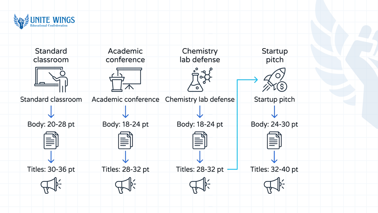
| Presentation setting | Slide title size | Section header size | Body and bullet minimum | Source / Standard |
|---|---|---|---|---|
| Standard college classroom (3–10m depth) | 44–54 pt | 30–36 pt | 28–32 pt (24 pt absolute floor) | TypographyMaster & Presentations.ai (2026) |
| Academic conference / Seminar hall | — | — | 32–36 pt | UbiComp / ISWC Accessibility Guidelines (2025) |
| Chemistry / Lab research defense | 28–38 pt | — | 24 pt minimum | American Chemical Society (ACS) Guidance (2026) |
| Startup pitch / Hackathon demo | — | — | 30 pt minimum | Guy Kawasaki's 10/20/30 rule via Quora (2011) |
Fix 2: The 14-point default template trap
Before: You copy four paragraphs of system requirements into a default PowerPoint layout. PowerPoint auto-shrinks the Calibri body font down to 14 pt so all 140 words fit inside the bounding box, and each line stretches to 120 characters across a 16:9 widescreen slide.
After: Turn off "Shrink text on overflow" in PowerPoint (Format Shape > Text Options > Text Box > Do not Autofit). Lock the body font to 28 pt Inter, Arial, or Calibri, and narrow the text box so each line holds between 50 and 75 characters including spaces, which Peregrine Communications (2023) identifies as the optimal line length for reading speed. Run the laptop distance test right in your hostel room: put your slide in full-screen mode on a 14-inch or 15-inch laptop, step back 10 to 12 feet (about four big paces), and try to read the smallest label on your slide. If you have to squint, increase the font by 6 pt.
Why do dark-mode slides often fail on classroom projectors?
Dark-mode slides fail in college classrooms because ambient sunlight from windows and overhead tube lights washes out dark pixels on low-lumen projectors, while pure black backgrounds (#000000) with pure white text (#FFFFFF) trigger an optical blur called halation that makes letters vibrate and bleed for nearly half the room.
Computer science and electronics students love dark-mode slides because they live inside dark-themed IDEs like VS Code. That preference clashes with human biology and classroom hardware. Research compiled by Medium's accessibility review (2025) shows that roughly 47% to 50% of the population has astigmatism. When a person with astigmatism looks at bright white text on a dark background, their iris opens wider to let in more light, and the curved lens scatters that light into a fuzzy halo around every letter. As The Skins Factory's 2026 UI/UX guide explains, pairing pure black (#000000) with bright white text creates visual vibration ("halation") that causes eye strain within minutes.
On top of halation, MontanaB's 2025 accessibility analysis and AccessibilityChecker (2026) point out that in brightly lit classrooms, dark-mode slides suffer from severe glare and a faded, muddy appearance compared to light backgrounds. Both Section 508 and WCAG 2.1 standards require a minimum contrast ratio of 4.5:1 for normal body text and 3:1 for large headings, with stricter interpretations calling for 7:1 in variable room lighting. A washed-out college projector with dust on the lens drops a dark-theme slide's real-world contrast well below 3:1.
Fix 3: The neon-on-black developer slide
Before: A slide with a #000000 pure black background, #FFFFFF pure white 20 pt body text, and neon purple (#8A2BE2) subheadings for a blockchain project presentation in a third-floor classroom with afternoon sun hitting the screen. From row three, the purple subheadings disappear completely into the gray projector wash, and the white text blooms into fuzzy streaks.
After: Use this decision rule based on the room:
- If you are presenting in a standard Indian classroom, lab, or seminar hall with windows or tube lights stays on, switch to a light theme: an off-white background (
#F8F9FAor#F4F4F6) so the projector bulb does not blind you, paired with dark charcoal text (#1E1E24) and a dark navy or forest green accent that clears a 7:1 contrast ratio. - If you are presenting in a windowless, pitch-dark auditorium where a dark theme is mandatory, replace pure black
#000000with dark charcoal gray (#1E1E1Eor#252526) and use soft off-white text (#E0E0E0) to stop halation.
Fix 4: The pastel Canva aesthetic template
Before: A management or design student picks a trendy Canva template with a beige background (#F5EBE6) and light sage green (#A3B899) or pale coral body text. On a calibrated MacBook screen it looks subtle; on a 5-year-old classroom projector, the sage green text vanishes into a blank beige rectangle because its contrast ratio sits around 1.8:1, far below the 4.5:1 WCAG floor.
After: Keep the beige background if you like the warmth, but change every single text box and icon to deep espresso brown (#2B1B17) or charcoal (#1A1A1A). Check your hex codes before exporting by pasting your background and text colors into any free WCAG contrast checker; if the number is under 7:1, darken the text.
How should you crop code snippets or Excel tables so they are legible?
Never paste full-screen screenshots of your IDE or multi-column Excel sheets onto a slide; instead, crop code down to the 5 to 10 lines of core logic in a high-contrast monospaced font, and rebuild spreadsheet extracts as native 3-to-4 column PowerPoint tables with cell shading on the summary row.
TestDouble and Stack Exchange guidelines (2021–2026) state that raw code files must be edited down to 5 to 10 essential lines using a monospaced font, line numbers, and restrained syntax highlighting that avoids multi-color visual clutter on projectors. For spreadsheets and literature surveys, Section508.gov's 2025 table guidelines and Temple University's accessibility guide mandate using native built-in table tools rather than pasting uncropped image screenshots of grids.
Fix 5: The 60-line VS Code screenshot
Before: To prove you wrote the backend yourself, you press PrtScn on your 1920x1080 laptop screen showing VS Code with the file tree on the left, the terminal at the bottom, 60 lines of Python imports and boilerplate try/except blocks in the center, and a dark theme with 8 different syntax colors. On the projector, the code sits at an effective font size of 6 pt. Nobody can read a single variable name.
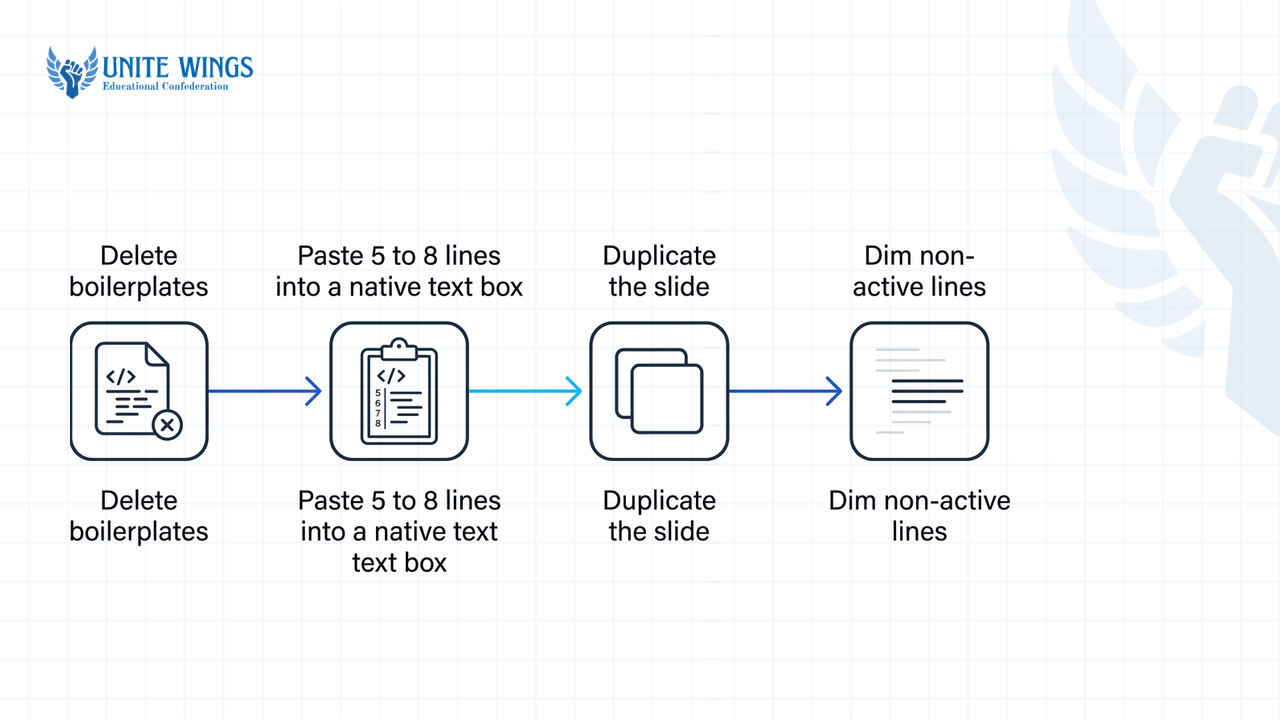
After: Follow this 4-step workflow from Slides.com and TestDouble (2026) to use progressive disclosure:
- Delete imports, class declarations, error handling, and closing brackets. Copy only the 5 to 8 lines where your algorithm actually computes the result.
- Paste those 5 to 8 lines into a native text box (or a clean code image generator set to a light theme) using Consolas, Fira Code, or JetBrains Mono at 20–24 pt font size, with line numbers turned on.
- Duplicate the slide in PowerPoint (
Ctrl+D). - On the first slide, show all 8 lines. On the duplicated slide, dim lines 1–4 and 7–8 down to 30% opacity (or draw a semi-transparent white box over them) so only lines 5–6 remain at full brightness while you tell the panel, "Look at line 5: this is where we cut query time in half."
Fix 6: The 10-column literature survey or financial Excel screenshot
Before: Every final-year project viva requires a Literature Survey slide, and every MBA case presentation requires a financial table. Students usually take a screenshot of an Excel sheet with 10 columns (Sr. No., Author & Year, Title of Paper, Journal/Conference, Methodology Used, Dataset, Accuracy, Pros, Cons, Research Gap) across 12 rows. The text shrinks to 8 pt and the gridlines blur.
After: Apply Prezentio's 2025 Excel-to-PowerPoint formatting method and Section 508 rules:
- Insert a native PowerPoint table (
Insert > Table) restricted to 3 or 4 columns and at most 5 rows. - For a literature survey, keep only
Author (Year),Method,Key Metric, andWhat It Missed. Cut paper titles and journal names; put the full 12-paper table in your printed report appendix. - For a financial or benchmark table, keep
Model / Metric,Baseline,Our Result, and% Change. - Set all table cells to at least 24 pt font, remove vertical gridlines, and apply a soft yellow or light blue background fill to the bottom row (your model or total row) with bold text so the evaluator's eye goes straight to your win.
What is the 1-idea-per-slide rule and when can you break it?
The 1-idea-per-slide rule states that each slide should carry one core claim or takeaway so the audience grasps it in under three seconds, though you can break it for side-by-side comparisons or end-to-end system architectures if you gray out inactive parts step by step.
Originating in Garr Reynolds' Presentation Zen and Nancy Duarte's Slide:ology (SlideModel & Free PowerPoint Templates, 2026), the rule protects your audience from cognitive overload. According to Conversations on Careers (2026) and SlideStack (2026), your slide must pass the 3-Second Glance Test: if a panelist looking up from your resume or project file cannot understand the point of your slide within three seconds, it has too many competing ideas.
However, technical students run into a real edge case: sometimes splitting a slide destroys context. If you put a 4-stage cloud architecture pipeline across four separate slides, the external examiner loses track of how Stage 1 feeds into Stage 4. A 2026 review by SlideStack and Stack Exchange notes that when you must keep multiple connected steps or a side-by-side comparison on one slide, you should isolate the active element using opacity or a focus box.
Fix 7: The "System Architecture + Tech Stack + Future Scope" combo slide
Before: Because a professor told the class "maximum 10 slides per group," a student crams the block diagram on the left, six logos of the tech stack (React, Node, MongoDB, Docker, AWS, TensorFlow) in the top right, and four bullet points of "Future Scope" in the bottom right. The evaluator stares at the Docker logo while you are talking about the database schema.
After: First, ask if the 10-slide cap is a strict file limit or a time limit (like Guy Kawasaki's 20-minute rule). Adding slides does not make a talk longer if each slide takes 20 seconds to process. Split "Tech Stack" and "Future Scope" onto their own slides. For the complex 5-block System Architecture diagram that must stay intact on one screen, duplicate that architecture slide three times:
- Slide 4A: Full architecture diagram visible so the room sees the whole map (say: "Our pipeline has three stages: ingestion, model inference, and alerting").
- Slide 4B: Ingestion box at 100% opacity with a coloured focus box; Inference and Alerting boxes faded to a lower opacity.
- Slide 4C: Inference box at 100% opacity; Ingestion and Alerting faded to a lower opacity.
Your slide transitions do the pointing for you, and you never need a laser pointer that shakes when you are nervous. And if speaking speed or stage fright is what makes you cram text onto slides as a crutch, the Group Discussion and Speaking Masterclass walks you through structuring verbal delivery so you can speak from three-word prompts without freezing.
How to clean up your deck before tomorrow's presentation
Do not try to redesign all 20 slides at once; run a 45-minute triage pass in this order so your deck is ready for the classroom projector:
- Tonight (15 minutes): Run the 15-word cut. Open your
.pptxin Outline View. Find every slide with more than 30 words, cut the paragraph (Ctrl+X), paste it into the Speaker Notes pane at the bottom, and type back one 6-word result headline and three 3-word bullet points. - Tonight (15 minutes): Fix fonts and theme. Use
View > Slide Masterto change the background to off-white (#F8F9FA), set the master title font to 44 pt and body font to 28 pt dark charcoal (#1E1E24), and replace any screenshot tables with native 3-column PowerPoint tables. - Tomorrow morning (15 minutes): The 12-foot test and backup export. Step 12 feet back from your laptop screen and click through every slide, spending 3 seconds per slide. Export two files onto a USB drive and your Google Drive: the
.pptxfile and a flattened.pdffile, so a lab PC missing your custom fonts cannot scramble your layout five minutes before your viva.
Build clean slides in half the time
If you want to stop fighting PowerPoint alignment boxes before every seminar, hackathon pitch, or placement presentation, join the Canva AI Masterclass. You will learn how to use Magic Design and Magic Write to turn rough project notes into high-contrast, projector-ready slide decks and visual cards you can use for your next college review.
Frequently asked questions
Why can't the audience read my college presentation slides from the back row?
Your audience cannot read your slides because default PowerPoint and Canva templates use 14 to 18 pt fonts meant for printed pages or laptop screens. Classroom viewers sit 3 to 10 meters away, which requires at least 28 to 32 pt for body text and 44 to 54 pt for titles.
How many words should be on a single PPT slide for a college project?
Keep each slide between 15 and 25 words total, arranged as one 5-to-7-word conclusion headline and three short bullet points. If your slide cannot pass the 3-Second Glance Test, move the extra explanation into your speaker notes or a separate printed appendix for your evaluator.
Is dark mode good for PowerPoint presentations on classroom projectors?
No, dark mode performs poorly in most college classrooms because window light and tube lights wash out dark backgrounds on low-lumen projectors. Pure black backgrounds with white text also cause halation (glowing, blurry edges), which strains the eyes of the 47% to 50% of audience members who have astigmatism.
How do I present a long block of code or an Excel sheet on a slide?
Never paste a full-screen screenshot of your IDE or spreadsheet. Crop code down to the 5 to 10 lines of core logic in a 20 to 24 pt monospaced font, and rebuild Excel data as a native 3-to-4 column PowerPoint table with bold shading on the summary row.
Why do professors and placement recruiters dislike text-heavy PPTs?
Evaluators dislike walls of text because human working memory cannot read a dense slide and listen to you speak at the same time. According to Infinity College's 2026 framework, 85% of recruiters rank communication as the top fresher skill, and reading your own slides aloud signals poor preparation.
Can I break the one-idea-per-slide rule for technical diagrams?
Yes, you can break the rule when showing an end-to-end system architecture or a side-by-side comparison where splitting the slide would break context. Duplicate the slide for each step of your explanation and reduce the opacity of inactive blocks so the audience focuses on one piece at a time.
Newsletter
Stay updated with our latest news and insights.